Like I talked about in this post back in April, I have been itching to paint something dark for a while now. I was at a loss for the longest time about where I could do it (must.have.more.walls) but after our trip to the prettiest B&B ever for our anniversary in May, I came up with a plan….

I’ve never been a huge fan of the color I painted our guest bedroom and office a few years ago, Valspar’s “Lovely Bluff”, it just came out more yellow and bright than I planned (was going for a muted beige). I was fine with it though, especially in the office cause, hey, it was better than three painted and one white wall. Then other projects came along so I forgot about it.
So, back to our trip in May, I loooooved the paint color in our cottage and made a plan to paint our guestroom that same color. I emailed them and they will be getting back to me on what it is, can’t wait! But duh! if I can re-paint the guest room, I can re-paint the office…and I can re-paint it DARK! The office is a perfect place to be dark :) Color selection began while the husband was out of town one weekend. While I still want to paint black walls someday, this wasn’t the room, so a different dark was needed. I was inspired by dark rooms of some of my favorite bloggers here, here, and here and settled on looking for a dark-smoky-navy-blue-gray. Looking through my Sherwin-Williams paint deck and their website, I came up with five possibilities:
*this is not sponsored in any way, I truly love SW paint, like, alot
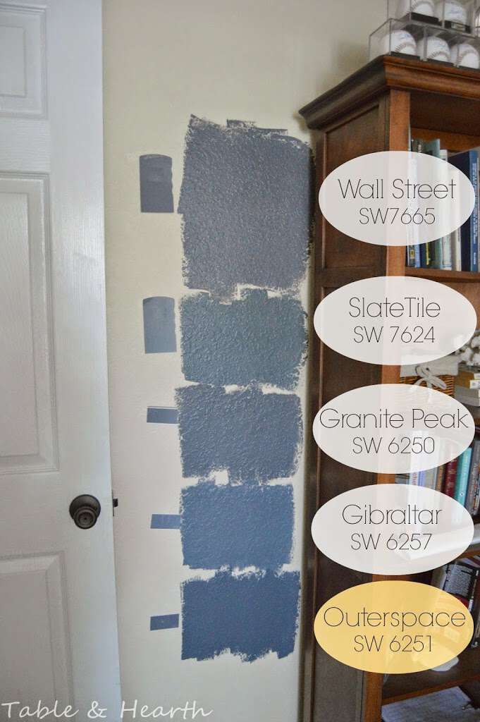
Lighting in this room is horrible to capture and changes on each wall throughout the day so I painted swatches on all four walls and stared at them for about a week, along with asking friends and family what they thought. I ruled out Slate Tile and Gibraltar pretty quick as they were just too blue (I’m not a blue fan), but was torn on the other three. I was leaning towards Granite Peak. But for everyone else, including the husband, it was almost unanimous for the darkest color, Outerspace, which surprised me. In the store, I was almost too scared to pull the trigger on it and run to Granite Peak, but I figured I’d take a risk and go for it. One gallon of Duration satin finish in Outerspace later and there was no going back.
Then, there were some minor freakouts with the first coat. 1) When I poured it out it looked really gray, 2) dry on the wall it looked too navy, and then 3) I had pretty poor coverage on that first coat which made me worry that one gallon wouldn’t do it and I’d have mismatched colors. The navy-ness really freaked me out and I really started regretting going so dark (for me).
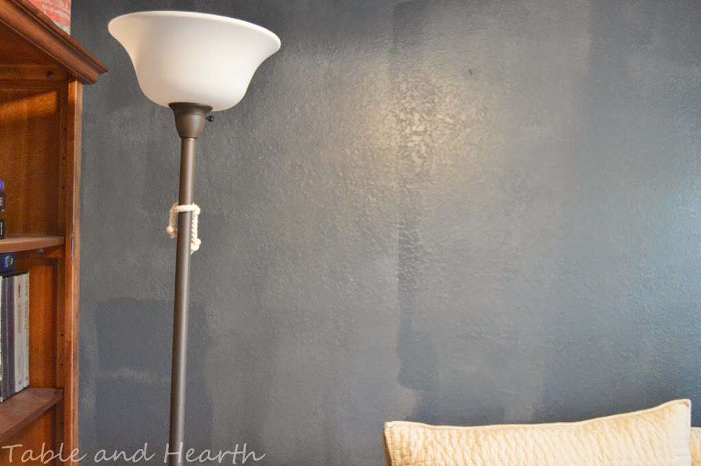
You can see below where my test swatches could really be seen through the first coat. No, I didn’t do a tinted primer cause I’m lazy and cheap. It would have helped, I know…
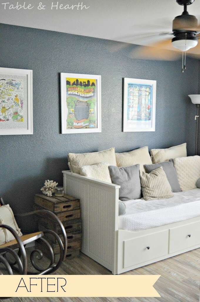
But I didn’t need it because the second coat came through for me and I am soooo glad I took the risk on the darkest color! SW paints always had such awesome coverage in my opinion so I was really bummed when the first coat was so transparent. I thought there was no way I was going to get away with only two coats but good ‘ol Sher-dub pulled through for me. Coverage with that second coat was perfect and no third coat was needed (I had about 1/4 gallon left over). Just look at how solid and smooth this color is! All my worries were out the window and I instantly fell in love with the color after the second coat.
(Probably doing a gallery wall above the desk here!)
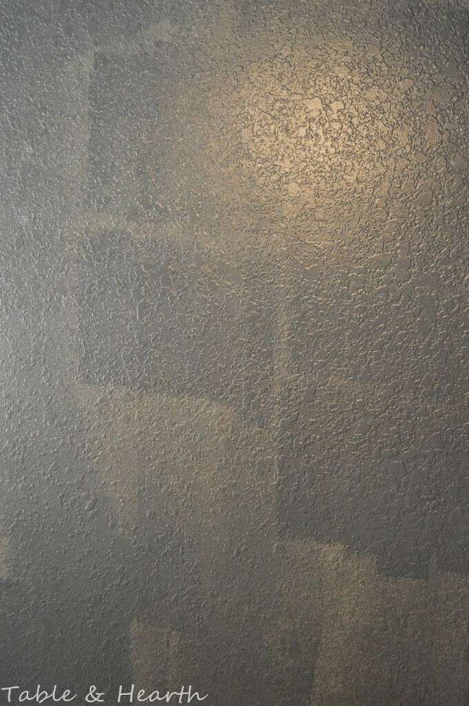
Again, the light is really weird in this room so it’s hard to get a good shot of this color since it’s a little different on each wall and at different times of the day. Sometimes it’s more lighter and blue, sometimes it’s dark and stormy gray, and occasionally it kind of has a greenish tint to it. It’s awesome.

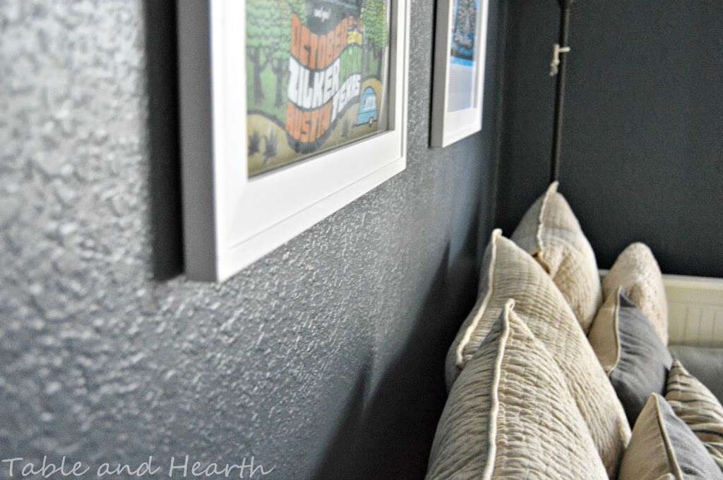

I think this close-up most accurately shows the color as we see it most of the time. So moody.


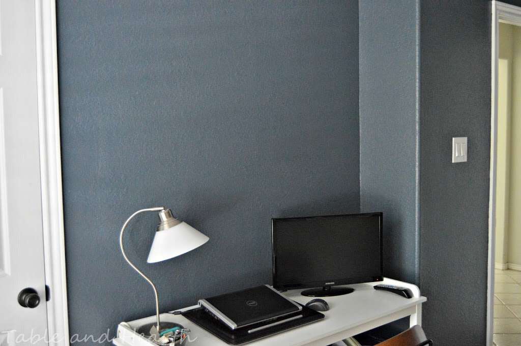
I love how it makes everything pop in the room, the whites, the natural woods, the floors. There are still some tweaks I want to make in here; I am hoping to find a funky brass floor lamp to replace this one someday soon, the bookcase decor is being re-done, and the desk area is still in need of some oomph and a gallery wall, so the room isn’t complete quite yet but that aside, I think the paint really makes it feel warmer, cozier, and more put-together. Even with the dark paint and what little light this room receives, the room isn’t dark at all like I was worried about.
I just want to sit in there all the time now and pet stare at the walls. I am a complete dark-wall convert now. Make all the things dark!!
I will be going through a few of my go-to tried and true painting supplies, especially for having textured walls, on Friday so check back in then!


Love this!
Thanks Paula! Excited to see how y’all’s comes out!
Love the blue Emily! And I love your art work!
Thanks Karen! I started going in 2008 and we try to go every year (but have missed a couple :/), so.much.fun!!
Goodness, Emily, I’d be happy to move into your office and make it my bedroom. So pretty and so cozy. Love the bed/couch and the rocker. I daydream about getting a rocker next time I have a baby. I think your reno looks great!
Aw, thank you Jelli! I actually wanted to stay in there this weekend but the husband wasn’t too keen on that :) As far as the rocker, I lucked out and stole it from my mom, she had it in our house ever since I can remember, and yes, it would be perfect for a nursery!
That colour is gorgeous!
Thanks Karen! It changes throughout the day too, it’s awesome!
It definitely makes everything pop out, and I am such a sucker for gray! Thanks for linking up to the Pretty Preppy Party!
I loooove this color, it’s perfect!!
What a gorgeous makeover! The paint color is perfection! Thank you for linking up to our Pretty Preppy Party.
Sarah @ Life On Virginia Street
I am in love with this color! Thanks Sarah!! And thanks for the party :)
Love the room! Do you think the color would look good with oak trim? Where did you get the bed couch? I love it. Perfect for extra sleeping in an office.
Hi Dena! I think this color looked really good up against a natural wood color, like your oak probably is. It’s not a great picture unfortunately, but you can kind of see how it works with that medium-tone wood bookcase. The daybed is the Hemnes from Ikea, and those three (huge!) drawers are actually part of a trundle that pulls out so it’ll sleep 2! It was one of the first purchases for our house so we could sleep people for that Christmas. We’ve loved it ever since :) Oh, and it’s $100 less now than it was when we got it!
I was this.close to getting Gibraltar, but seeing those wall painted swatches … Gibraltar is waaay too blue. I had ruled out outerspace as too dark, but it looks phenomenal & gives the grey I’m looking for (deep grey with tiniest hint of blue). Thank you!!
It is such a beautiful color, we loved it in that room!!